
We read your photo as:
What are Greekings in graphic design and what factors contribute to a perfect page layout?
ScanSolve AI Answer
-
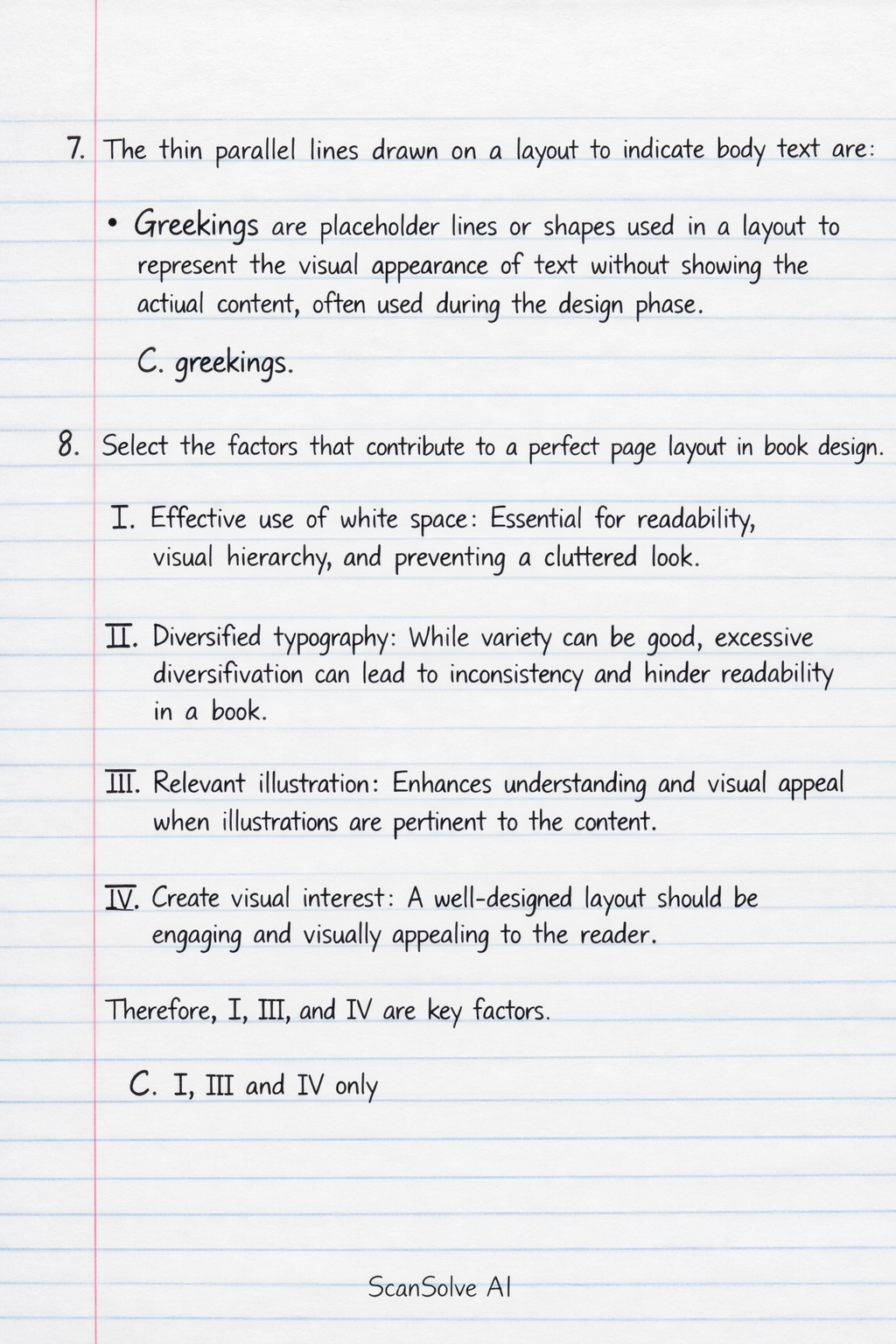
The thin parallel lines drawn on a layout to indicate body text are
- Greekings are placeholder lines or shapes used in a layout to represent the visual appearance of text without showing the actual content, often used during the design phase.
- C. greekings.
-
Select the factors that contribute to a perfect page layout in book design.
- I. Effective use of white space: Essential for readability, visual hierarchy, and preventing a cluttered look.
- II. Diversified typography: While variety can be good, excessive diversification can lead to inconsistency and hinder readability in a book.
- III. Relevant illustration: Enhances understanding and visual appeal when illustrations are pertinent to the content.
- IV. Create visual interest: A well-designed layout should be engaging and visually appealing to the reader.
- Therefore, I, III, and IV are key factors.
- C. I, III and IV only
-
Koku is a graphic designer who uses traditional media such as acrylic paint and poster colour. From the following options, identify the best way Koku can clean and maintain his brush after use. Koku should
- Proper brush maintenance involves cleaning the brush thoroughly, reshaping the bristles to their original form, allowing it to air-dry completely to prevent damage, and then storing it properly.
- A. clean, reshape, air-dry and store.
-
A strategy that a graphic design entrepreneur would adopt to beat competition is by
- Specializing in a specific niche allows an entrepreneur to become an expert in that area, attract targeted clients, and differentiate themselves from generalists, leading to a stronger competitive advantage.
- B. specializing in a specific niche.
-
Signage items include
- Signage refers to graphic displays primarily used for conveying information, advertising, or direction in public or commercial spaces. Billboards are a prominent example of such displays.
- A. billboards.
-
Identify the most appropriate way to handle and store graphic design prints and artworks.
- Storing prints flat in a protective sleeve prevents creasing, bending, and protects them from dust, light, and environmental damage, thus preserving their quality.
- A. Carefully store them flat in a protective sleeve
-
Which of the following techniques is William Morris closely associated?
- William Morris, a central figure in the Arts and Crafts movement, was renowned for his revival of traditional printing methods, particularly woodcut printing, which he extensively used for his books and patterns through the Kelmscott Press.
- D. Woodcut printing
-
The use of colour gradation by graphic designers in their drawings, is to
- Colour gradation, which is the gradual transition from light to dark or one color to another, is a fundamental technique for creating depth, volume, and the illusion of three-dimensionality, which is characteristic of chiaroscuro.
- C. create a range of chiaroscuro.
-
In printing, the use of a device to etch designs onto metal plates, describes the technique of
- Intaglio printing is a family of printing techniques where the image is incised or etched into a surface (typically a metal plate), and the incised lines hold the ink.
- C. intaglio printing.
-
The best reason for using dominant colours in poster design is to
- Dominant colors are strategically used in poster design to immediately capture the viewer's attention and make the poster stand out, ensuring the message is seen.
- A. evoke attention to details.
Still stuck on this one?
Ask a follow-up, and the answer starts from this question.
More Computer Science Questions
Handwritten Step-by-Step Solution
Get this as a handwritten image on WhatsApp — like a tutor wrote it for you.
Try on WhatsApp