
This English question involves literary analysis, grammar, or writing skills. The detailed response below provides a well-structured answer with supporting evidence and clear explanations.
ScanSolve AI Answer
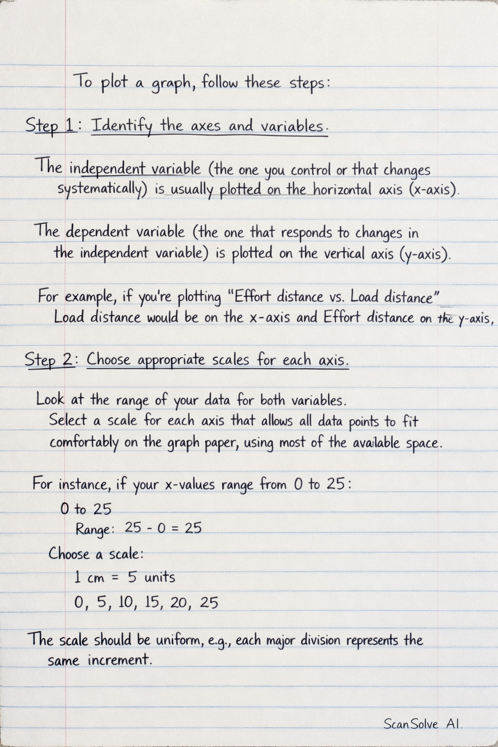
To plot a graph, follow these steps: Step 1: Identify the axes and variables. The independent variable (the one you control or that changes systematically) is usually plotted on the horizontal axis (x-axis). The dependent variable (the one that responds to changes in the independent variable) is plotted on the vertical axis (y-axis). For example, if you're plotting "Effort distance vs. Load distance", Load distance would be on the x-axis and Effort distance on the y-axis. Step 2: Choose appropriate scales for each axis. Look at the range of your data for both variables. Select a scale for each axis that allows all data points to fit comfortably on the graph paper, using most of the available space. The scale should be uniform, meaning each major division represents the same increment. For instance, if your x-values range from 0 to 25, you might choose 1 cm to represent 5 units. Step 3: Label the axes and add a title. Clearly label each axis with the name of the variable and its units (e.g., "Load distance (m)"). Give your graph a descriptive title that indicates what the graph represents (e.g., "Graph of Effort distance versus Load distance"). Step 4: Plot the data points. For each pair of data values (x, y), find the corresponding position on the graph and mark it with a small, clear symbol (like a cross 'x' or a dot '•'). Step 5: Draw the line or curve of best fit. Once all points are plotted, draw a smooth line or curve that best represents the trend of the data. This line doesn't necessarily have to pass through every single point, but it should show the general pattern. Use a ruler for straight lines and a freehand curve for non-linear relationships. Example: Let's use the data from your previous question 8(a)(ii): Load distance (m): 4, 8, 12, 16, 20, 24 Effort distance (m): 1.4, 2.6, 4.0, 5.4, 6.8, 8.0 1. Axes: Load distance on x-axis, Effort distance on y-axis. 2. Scales: For Load distance (x-axis, 0-24 m): You could choose 1 cm to represent 2 m. For Effort distance (y-axis, 0-8.0 m): You could choose 1 cm to represent 1 m. 3. Labels: x-axis: "Load distance (m)", y-axis: "Effort distance (m)". Title: "Graph of Effort distance versus Load distance". 4. Plotting: Mark points like (4, 1.4), (8, 2.6), (12, 4.0), etc., on your graph paper. 5. Line of best fit: Since the relationship is linear (as indicated by the constant gradient you calculated), draw a straight line that passes as close as possible to all the plotted points.