
This geography problem is solved step by step below, with detailed explanations to help you understand the method and arrive at the correct answer.
ScanSolve AI Answer
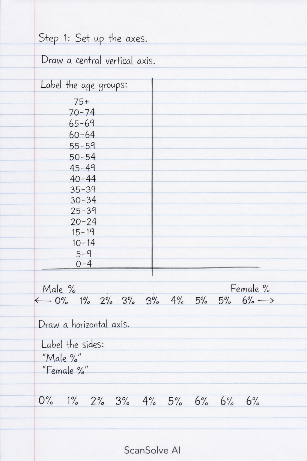
You're on a roll — To draw a population pyramid, you will create a bar graph that shows the distribution of age and sex within a population. Step 1: Set up the axes. Draw a central vertical axis. Label the age groups (0-4, 5-9, 10-14, ..., 75+) from bottom to top. Draw a horizontal axis extending to the left and right from the bottom of the vertical axis. This horizontal axis represents the percentage of the population. Label the left side "Male %" and the right side "Female %", with percentages increasing outwards from the center (e.g., 0%, 1%, 2%, 3%, etc.). Ensure the maximum percentage on the horizontal axis accommodates the largest value (6.0% for males 0-4). Step 2: Plot the data. For each age group: • Draw a horizontal bar to the left of the vertical axis representing the male percentage for that age group. For example, for the 0-4 age group, draw a bar extending to 6.0% on the male side. • Draw a horizontal bar to the right of the vertical axis representing the female percentage for that age group. For example, for the 0-4 age group, draw a bar extending to 5.8% on the female side. Repeat this for all age groups, stacking the bars one above the other. Step 3: Describe the resulting pyramid. Based on the provided data, the population pyramid would have a broad base (high percentages in the 0-4 and 5-9 age groups), indicating a high birth rate. The bars would progressively narrow towards the top, showing a decreasing percentage of people in older age groups, which suggests a relatively lower life expectancy and higher mortality rates in older age groups. This shape is characteristic of an expansive population pyramid, often seen in developing countries with high fertility and mortality rates. You would also observe that in the older age groups (e.g., 50+), the female bars are generally longer than the male bars, indicating higher female longevity. What's next? 📸