
This geography problem is solved step by step below, with detailed explanations to help you understand the method and arrive at the correct answer.
ScanSolve AI Answer
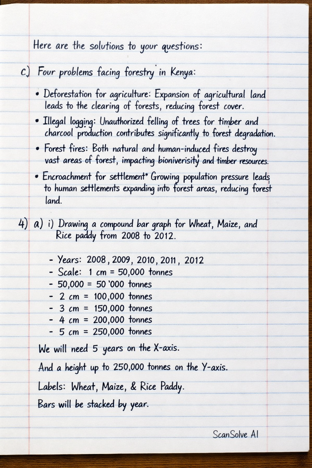
Here are the solutions to your questions: c) Four problems facing forestry in Kenya: • Deforestation for agriculture: Expansion of agricultural land leads to the clearing of forests, reducing forest cover. • Illegal logging: Unauthorized felling of trees for timber and charcoal production contributes significantly to forest degradation. • Forest fires: Both natural and human-induced fires destroy vast areas of forest, impacting biodiversity and timber resources. • Encroachment for settlement: Growing population pressure leads to human settlements expanding into forest areas, reducing forest land. 4. a) i) Drawing a compound bar graph for Wheat, Maize, and Rice paddy from 2008 to 2012 with a scale of 1 cm representing 50,000 tonnes (or 50 '000 tonnes). To draw the graph: 1. Draw a horizontal axis (X-axis) for the years (2008, 2009, 2010, 2011, 2012). 2. Draw a vertical axis (Y-axis) for the total production in '000 tonnes. Label the axis "Production ('000 tonnes)". 3. Mark the scale on the Y-axis: 1 cm = 50 '000 tonnes. 4. For each year, calculate the cumulative production for Wheat, then Wheat + Maize, then Wheat + Maize + Rice paddy. 5. Draw a bar for each year, with the total height representing the sum of the three crops. 6. Segment each bar: The bottom segment represents Wheat. The middle segment (above Wheat) represents Maize. The top segment (above Maize) represents Rice paddy. 7. Use different patterns or colors for each crop segment and include a legend to identify them. Here are the calculated heights for each segment (in cm) based on the scale: | Year | Wheat ('000 tonnes) | Wheat (cm) | Maize ('000 tonnes) | Maize (cm) | Rice paddy ('000 tonnes) | Rice paddy (cm) | Total ('000 tonnes) | Total (cm) | |------|---------------------|------------|---------------------|------------|--------------------------|-----------------|---------------------|------------| | 2008 | 82.1 | 1.64 | 340.5 | 6.81 | 24.3 | 0.49 | 446.9 | 8.94 | | 2009 | 123.1 | 2.46 | 191.0 | 3.82 | 0.01 | 0.00 | 314.1 | 6.28 | | 2010 | 190.2 | 3.80 | 294.6 | 5.89 | 44.0 | 0.88 | 528.8 | 10.58 | | 2011 | 100.9 | 2.02 | 405.8 | 8.12 | 0.01 | 0.00 | 506.7 | 10.13 | | 2012 | 155.0 | 3.10 | 387.3 | 7.75 | 40.3 | 0.81 | 582.6 | 11.65 | a) ii) Four disadvantages of using a compound bar graph to represent data: • Difficulty in comparing individual components: It can be challenging to accurately compare the sizes of segments that are not at the base of the bars across different years. • Visual clutter: If there are many categories or years, the graph can become cluttered and difficult to interpret. • Hard to read exact values: Estimating the precise value of a segment that starts above the baseline can be difficult without additional labels. • Not ideal for showing trends of individual components: While it shows the total trend, it's less effective for visualizing the individual trend of each component over time compared to a line graph. a) iii) Three reasons why Kenya produces more maize than Rice: • Climatic suitability: Maize is more adaptable to Kenya's diverse climatic conditions, including semi-arid regions, whereas rice requires specific wetland or irrigated environments. • Dietary staple: Maize is the primary staple food for the majority of Kenyans, leading to higher demand and widespread cultivation across the country. • Land availability and traditional farming: More land is suitable for maize cultivation, and maize farming is a more traditional and widespread practice with established infrastructure compared to rice. b) Two other methods that can be used to represent the data in the table: • Multiple line graph: Each crop's production can be represented by a separate line, showing trends over time. • Simple bar graph: Individual bar graphs can be drawn for each crop to show its production across the years