
This geography problem is solved step by step below, with detailed explanations to help you understand the method and arrive at the correct answer.
ScanSolve AI Answer
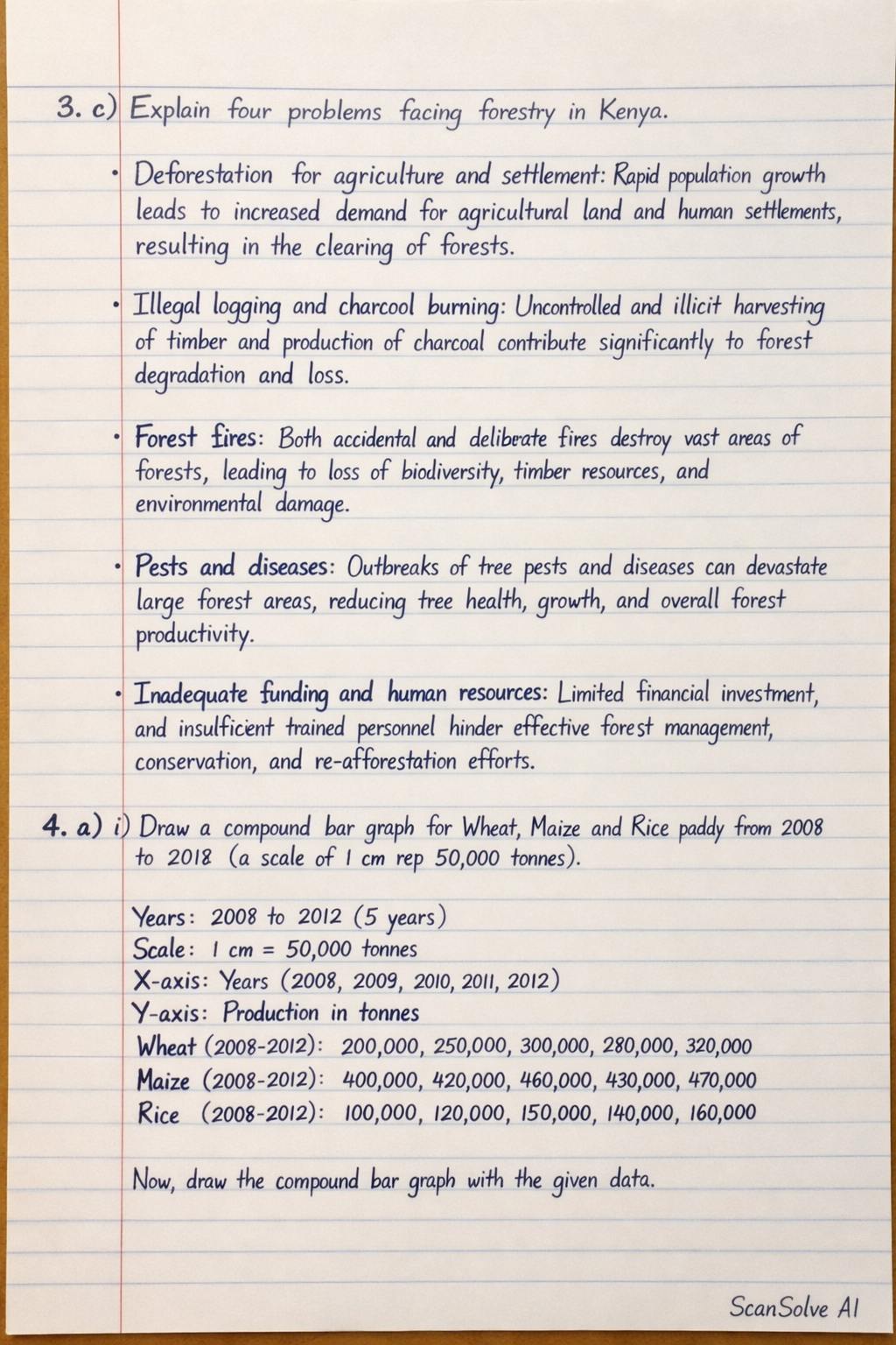
3. c) Explain four problems facing forestry in Kenya. Deforestation for agriculture and settlement: Rapid population growth leads to increased demand for agricultural land and human settlements, resulting in the clearing of forests. Illegal logging and charcoal burning: Uncontrolled and illicit harvesting of timber and production of charcoal contribute significantly to forest degradation and loss. Forest fires: Both accidental and deliberate fires destroy vast areas of forests, leading to loss of biodiversity, timber resources, and environmental damage. Pests and diseases: Outbreaks of tree pests and diseases can devastate large forest areas, reducing tree health, growth, and overall forest productivity. Inadequate funding and human resources: Limited financial investment and insufficient trained personnel hinder effective forest management, conservation, and re-afforestation efforts. 4. a) i) Draw a compound bar graph for Wheat, Maize and Rice paddy from 2008 to 2012 (a scale of 1cm rep 50,000 tonnes). Data for Compound Bar Graph (in '000 tonnes): | Year | Wheat | Maize | Rice paddy | Total Production | | :--- | :---- | :---- | :--------- | :--------------- | | 2008 | 82.1 | 340.5 | 24.3 | 446.9 | | 2009 | 123.1 | 191.0 | 22.6 | 336.7 | | 2010 | 190.2 | 294.6 | 44.0 | 528.8 | | 2011 | 100.9 | 405.8 | 48.7 | 555.4 | | 2012 | 155.0 | 387.3 | 40.3 | 582.6 | Steps to Draw the Graph: 1. Draw a horizontal axis (X-axis) and label it "Year". Mark the years 2008, 2009, 2010, 2011, and 2012 at equal intervals. 2. Draw a vertical axis (Y-axis) and label it "Production ('000 tonnes)". 3. Apply the scale: 1 cm represents 50,000 tonnes. Since the data is in '000 tonnes, 1 cm on the Y-axis will represent 50 units. Mark the Y-axis from 0 up to at least 600 '000 tonnes (e.g., 0, 50, 100, 150, ..., 600). 4. For each year, draw a single bar whose total height corresponds to the "Total Production" for that year. 5. Within each bar, divide it into three segments representing the production of Rice paddy, Wheat, and Maize. It is common to stack them in a consistent order, for example, Rice paddy at the bottom, then Wheat, then Maize at the top. For 2008, the Rice paddy segment will be (24.3)/(50) cm high. The Wheat segment will be (82.1)/(50) cm high, starting from the top of the Rice paddy segment. The Maize segment will be (340.5)/(50) cm high, starting from the top of the Wheat segment. 6. Use different colors or shading patterns for each crop (Wheat, Maize, Rice paddy) to differentiate them. 7. Include a clear legend to explain what each color/pattern represents. 8. Provide a suitable title for the graph, e.g., "Compound Bar Graph of Principal Crop Production in Kenya (2008-2012)". 4. a) ii) Give four disadvantages of using compound bar graph to represent data. Difficulty in comparing individual components: It is challenging to accurately compare the absolute values or trends of individual components, especially those not at the base of the bar, across different years. Hard to read precise values: Estimating the exact value of a segment, particularly those in the middle or top, can be difficult without additional labels. Limited number of components: If there are too many categories or components within each bar, the graph can become cluttered and difficult to interpret. Misleading visual representation: The visual impact of a component can be influenced by its position within the stack, potentially making it appear larger or