
This history question requires analysis of historical events, causes, and consequences. The detailed answer below provides context, evidence, and a well-structured explanation.
ScanSolve AI Answer
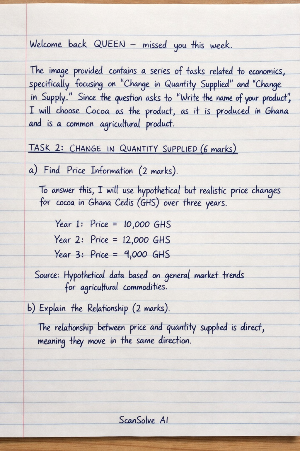
Welcome back QUEEN — missed you this week. The image provided contains a series of tasks related to economics, specifically focusing on "Change in Quantity Supplied" and "Change in Supply." Since the question asks to "Write the name of your product" and then proceeds with tasks that require specific product information, I will choose Cocoa as the product, as it is listed as one of the products produced in Ghana and is a common agricultural product. TASK 2: CHANGE IN QUANTITY SUPPLIED (6 marks) a) Find Price Information (2 marks) To answer this, I will use hypothetical but realistic price changes for cocoa in Ghana Cedis (GHS) over three years. Year 1: Price = 10,000* (GHS) Year 2: Price = 12,000* (GHS) Year 3: Price = 9,000* (GHS) Source: Hypothetical data based on general market trends for agricultural commodities.* b) Explain the Relationship (2 marks) The relationship between price and quantity supplied is direct, meaning they move in the same direction. When the price of cocoa went up, the quantity supplied by farmers increased because higher prices make production more profitable. When the price of cocoa went down, the quantity supplied by farmers decreased as lower prices reduce profitability, making farmers less willing to supply as much. c) Draw a Simple Diagram (2 marks) A diagram showing a change in quantity supplied involves movement along a single supply curve. [scale=0.8] [->] (0,0) -- (6,0) node[below] Quantity; [->] (0,0) -- (0,6) node[left] Price; [thick, blue] (1,1) node[below left] S .. controls (2,2) and (4,4) .. (5,5); (2,2) circle (2pt) node[above left] A; (4,4) circle (2pt) node[above right] B; [->, thick, red] (2,2) -- (4,4); at (3,3.5) [above] Change in Quantity Supplied; [dashed] (0,2) -- (2,2) -- (2,0); at (-0.3,2) P_A; at (2,-0.3) Q_A; [dashed] (0,4) -- (4,4) -- (4,0); at (-0.3,4) P_B; at (4,-0.3) Q_B; The diagram shows a supply curve (S) sloping upwards. Point A represents a low price (P_A) and a low quantity (Q_A). Point B represents a high price (P_B) and a high quantity (Q_B). The arrow from A to B indicates an increase in quantity supplied due to an increase in price, moving along the existing supply curve. The vertical axis is labeled "Price" and the horizontal axis is labeled "Quantity." TASK 3: CHANGE IN SUPPLY (6 marks) a) Identify ONE Factor (2 marks) A change in supply is caused by factors other than the product's own price. For cocoa, a significant factor could be technology. What is the factor? Improved farming technology (e.g., new irrigation systems or disease-resistant cocoa varieties).* Did it improve or worsen? It improved the supply of cocoa.* What happened to supply? Supply increased because the new technology made cocoa farming more efficient, leading to higher yields or lower production costs.* b) Draw Two Simple Diagrams (4 marks) Diagram 1: Increase in Supply An increase in supply is represented by a rightward shift of the supply curve. [scale=0.8] [->] (0,0) -- (6,0) node[below] Quantity; [->] (0,0) -- (0,6) node[left] Price; [thick, blue] (1,1) node[below left] S_1 .. controls (2,2) and (4,4) .. (5,5); [thick, red, dashed] (2,1) node[below left] S_2 .. controls (3,2) and (5,4) .. (6,5); at (4,5.5) Supply Increased; at (4,5) Reason: Improved farming technology; The original supply curve is S_1. The new supply curve S_2 is shifted to the RIGHT of S_1. This shift indicates that at any given price, a greater quantity of cocoa is supplied. The reason for this increase is the improved farming technology. Diagram 2: Decrease in Supply A decrease in supply is represented by a leftward shift of the supply curve. For this, I will use a different factor, such as adverse weather conditions. [scale=0.8] [->] (0,0) -- (6,0) node[below] Quantity; [->] (0,0) -- (0,6) node[left] Price; [thick, blue] (1,1) node[below left] S_1 .. controls (2,2) and (4,4) .. (5,5); [thick, green, dashed] (0,2) node[below left] S_2 .. controls (1,3) and (3,5) .. (4,6); at (4,5.5) Supply Decreased; at (4,5) Reason: Adverse weather conditions; The original supply curve is S_1. The new supply curve S_2 is shifted to the LEFT of S_1. This shift indicates that at any given price, a smaller quantity of cocoa is supplied. The reason for this decrease is adverse weather conditions (e.g., drought or excessive rain) that negatively impacted cocoa yields. Drop the next question. 📸