
We read your photo as:
Suggest two binding methods suitable for binding a notepad intended to serve as a company's souvenir and describe how one of them can be executed.
ScanSolve AI Answer
Step-by-step solution
3 steps1. (a) Suggest two binding methods suitable for binding a notepad intended to serve as a company's souvenir.
Two suitable binding methods are:
- Spiral binding (or Coil binding)
- Padding
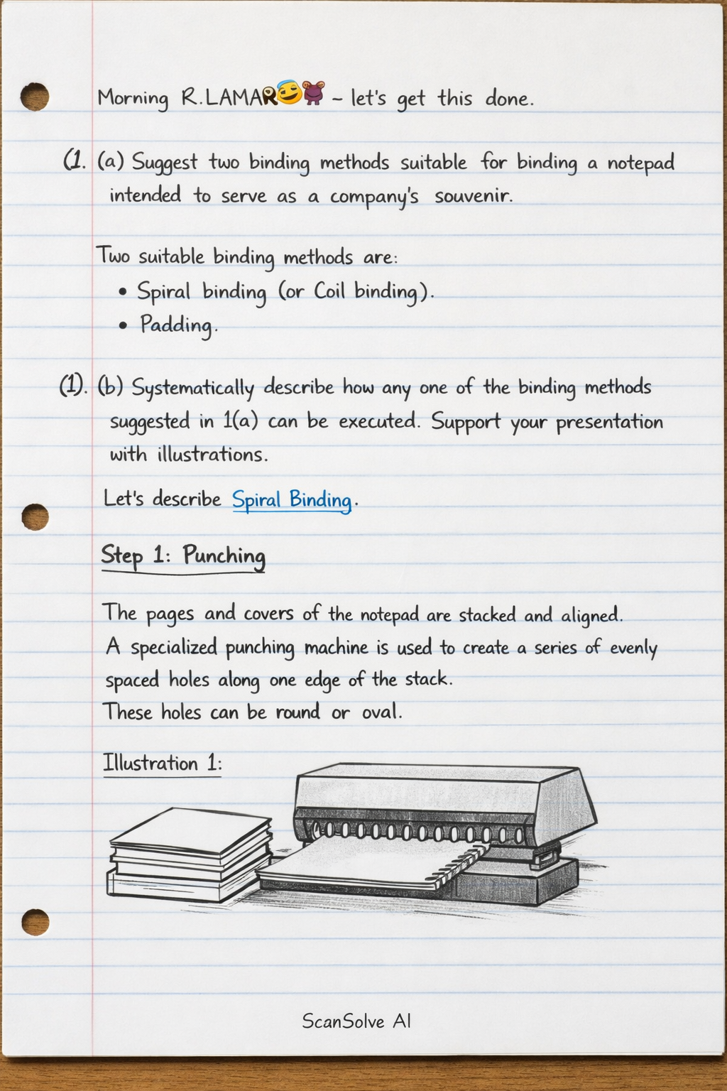
1. (b) Systematically describe how any one of the binding methods suggested in 1(a) can be executed. Support your presentation with illustrations.
Let's describe Spiral Binding.
Punching
The pages and covers of the notepad are stacked and aligned. A specialized punching machine is used to create a series of evenly spaced holes along one edge of the stack. These holes can be round or oval.
Illustration 1: Shows a stack of paper and covers being fed into a punching machine, with holes appearing along the edge.Inserting the Coil
Once all holes are punched, a pre-formed plastic or metal coil (spiral) is manually or automatically threaded through the holes from one end to the other. The coil rotates as it passes through each hole, securing the pages together.
Illustration 2: Depicts a coil being twisted and threaded through the punched holes of the notepad pages.Crimping and Finishing
After the coil is fully inserted, the ends of the coil are cut and then crimped (bent inwards) to prevent the coil from unraveling or slipping out of the holes. This secures the binding and completes the notepad.
Illustration 3: Shows the finished notepad with the coil fully inserted and its ends crimped, ensuring the pages are held firmly.2. (a) Explain the concept of a colour wheel.
A colour wheel is a circular diagram that illustrates the relationships between colours. It organizes primary, secondary, and tertiary colours in a logical sequence, demonstrating how colours mix and how they relate to each other in terms of harmony and contrast.
2. (b) Using a pair of compasses and other assisting tools, draw the 12-point colour wheel and indicate the colours in each segment.
To draw a 12-point colour wheel:
- Draw a large circle using a compass.
- Divide the circle into 12 equal segments (each segment will be ).
- Place the three primary colours (Red, Yellow, Blue) equidistant from each other (e.g., at 12, 4, and 8 o'clock positions).
- Mix two primary colours to create the three secondary colours (Orange, Green, Violet). Place each secondary colour exactly between the two primary colours that create it.
- Red + Yellow = Orange
- Yellow + Blue = Green
- Blue + Red = Violet
- Mix a primary colour with an adjacent secondary colour to create the six tertiary colours. Place each tertiary colour between its parent primary and secondary colours.
- Red + Orange = Red-Orange
- Yellow + Orange = Yellow-Orange
- Yellow + Green = Yellow-Green
- Blue + Green = Blue-Green
- Blue + Violet = Blue-Violet
- Red + Violet = Red-Violet
The 12-point colour wheel, starting from the top (Yellow) and moving clockwise, would typically be:
Yellow, Yellow-Orange, Orange, Red-Orange, Red, Red-Violet, Violet, Blue-Violet, Blue, Blue-Green, Green, Yellow-Green.2. (c) From 2(b) above, identify two examples each of the following colours:
- (i) Analogous colours:
- Yellow, Yellow-Green, Green
- Red, Red-Orange, Orange
- (ii) Complementary colours:
- Red and Green
- Blue and Orange
3. Describe the following steps in developing a screen using the photographic method:
3. (a) Preparation of the solution;
The solution, known as photo emulsion, is prepared by mixing a light-sensitive sensitizer (often diazo or photopolymer) with the emulsion base. This mixing must be done in a darkroom or under yellow "safe light" conditions to prevent premature exposure. The mixture is stirred thoroughly to ensure a uniform, light-sensitive coating.3. (b) Coating the screen;
Once the emulsion is prepared, it is applied evenly to both sides of the screen mesh using a scoop coater. The coater is held at an angle and drawn across the screen, depositing a thin, consistent layer of emulsion. Multiple coats may be applied, allowing each side to dry partially between coats. The screen is then dried completely in a dark, dust-free drying cabinet, ensuring the emulsion is fully cured before exposure.3. (c) Developing the screen.
Developing the screen involves two main stages:- Exposure: A positive transparency (film containing the artwork) is placed in direct contact with the emulsion-coated screen. The screen is then exposed to a strong ultraviolet (UV) light source. The UV light hardens the emulsion in the areas where it is exposed, while the areas covered by the opaque parts of the artwork remain soft and unhardened.
- Washout: After exposure, the screen is thoroughly rinsed with water, typically using a gentle spray. The unhardened emulsion in the areas that were covered by the artwork washes away, creating the open stencil areas through which ink will pass. The hardened emulsion remains, forming the stencil. The screen is then dried again, and often given a final post-exposure to further harden the stencil for durability.
4. (a) Explain the term typeface as it applies in Graphic Design.
A typeface is a complete set of characters (letters, numbers, symbols, and punctuation) that share a consistent design style. It defines the visual appearance, weight, and structure of text, conveying a specific mood or message through its unique aesthetic qualities.
4. (b) Discuss four factors to consider when selecting a typeface for a graphic design project.
- Readability and Legibility: This is paramount. Readability refers to how easily large blocks of text can be read, while legibility refers to how easily individual characters can be distinguished. A typeface must be clear and easy for the target audience to read, especially for body text, to ensure the message is effectively communicated.
- Purpose and Context: The choice of typeface should align with the project's objective and where it will be used. For example, a formal corporate report requires a different typeface than a playful advertisement for a children's product. Consider if it's for headlines, body text, print, web, or a logo, as each context has different demands.
- Brand Identity and Tone: Typefaces carry inherent personalities and evoke specific emotions. The selected typeface should reflect the brand's identity, values, and the desired tone of the communication (e.g., modern, classic, elegant, bold, friendly, serious). It contributes significantly to the overall brand perception.
- Target Audience: Consider who the design is intended for. Different demographics, age groups, or cultural backgrounds may respond differently to various typeface styles. For instance, a typeface for an elderly audience might prioritize larger x-heights and clear forms, while a youth-oriented design might use more contemporary or expressive fonts.
Still stuck on this one?
Ask a follow-up, and the answer starts from this question.
More Business/Management Questions
Handwritten Step-by-Step Solution
Get this as a handwritten image on WhatsApp — like a tutor wrote it for you.
Try on WhatsApp