
This economics question tests your understanding of economic models and analysis. The step-by-step answer below applies the relevant framework and explains the reasoning.
ScanSolve AI Answer
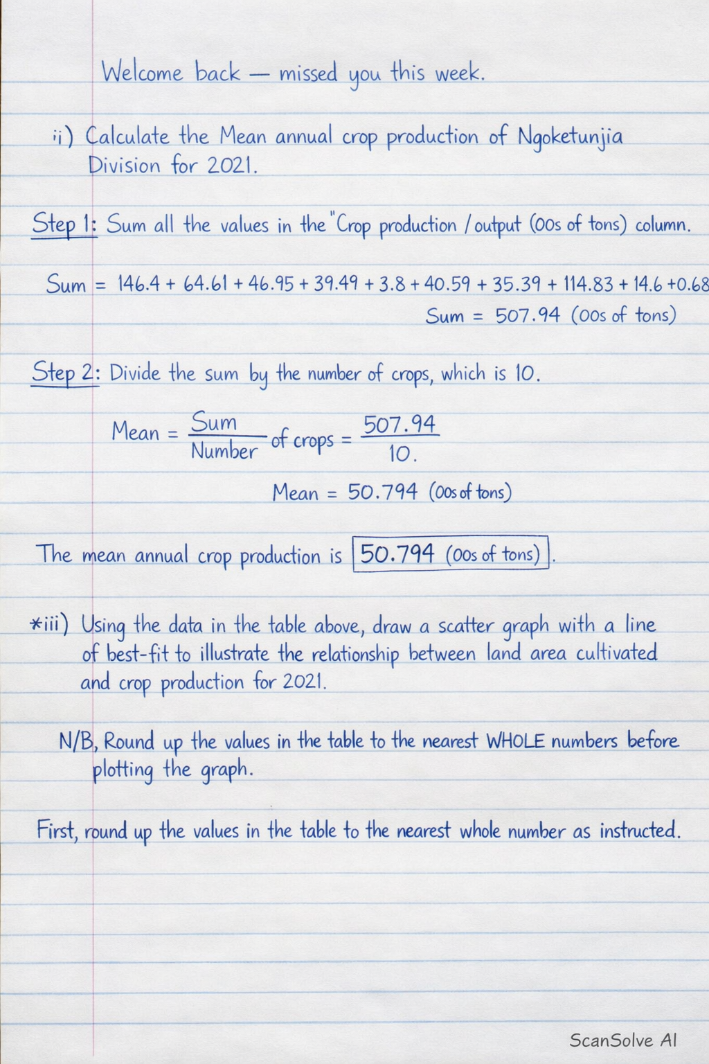
Welcome back — missed you this week. i) Calculate the Mean annual crop production of Ngoketunjia Division for 2021. Step 1: Sum all the values in the "Crop production / output (00s of tons)" column. Sum = 146.4 + 64.61 + 46.95 + 39.49 + 3.8 + 40.59 + 35.39 + 114.83 + 14.6 + 0.68 Sum = 507.94 (00s of tons) Step 2: Divide the sum by the number of crops, which is 10. Mean = SumNumber of crops = (507.94)/(10) Mean = 50.794 (00s of tons) The mean annual crop production is 50.794 (00s of tons). ii) Using the data in the table above, draw a scatter graph with a line of best-fit to illustrate the relationship between land area cultivated and crop production for 2021. N/B Round up the values in the table to the nearest WHOLE numbers before plotting the graph. Plot the land area cultivated on the horizontal axis and crop production on the vertical axis. First, round up the values in the table to the nearest whole number as instructed. | Main Crop | Land area cultivated (00s of hectares) (X) | Crop production / output (00s of tons) (Y) | |-------------|--------------------------------------------|--------------------------------------------| | Maize | 87 | 147 | | Rice | 33 | 65 | | Beans | 68 | 47 | | Cocoyam | 7 | 40 | | Peanut | 5 | 4 | | Cassava | 4 | 41 | | Plantain | 3 | 36 | | Tomato | 8 | 115 | | Huckleberry | 2 | 15 | | Oil Palm | 2 | 1 | To draw the scatter graph: • Draw a horizontal axis (x-axis) and label it "Land area cultivated (00s of hectares)". • Draw a vertical axis (y-axis) and label it "Crop production / output (00s of tons)". • Choose appropriate scales for both axes to accommodate the range of values (X from 2 to 87, Y from 1 to 147). • Plot each pair of rounded (X, Y) values as a point on the graph. For example, plot (87, 147) for Maize, (33, 65) for Rice, and so on. • After plotting all points, draw a line of best fit that represents the general trend of the data. This line should pass through the middle of the points, with roughly an equal number of points above and below it. Send me the next one 📸