
We read your photo as:
Answer five questions. Support your answers with relevant examples where necessary. Each question carries 20 marks.
ScanSolve AI Answer
Step-by-step solution
6 stepsHere's how you would use Microsoft Word to produce a professional-looking invitation letter:
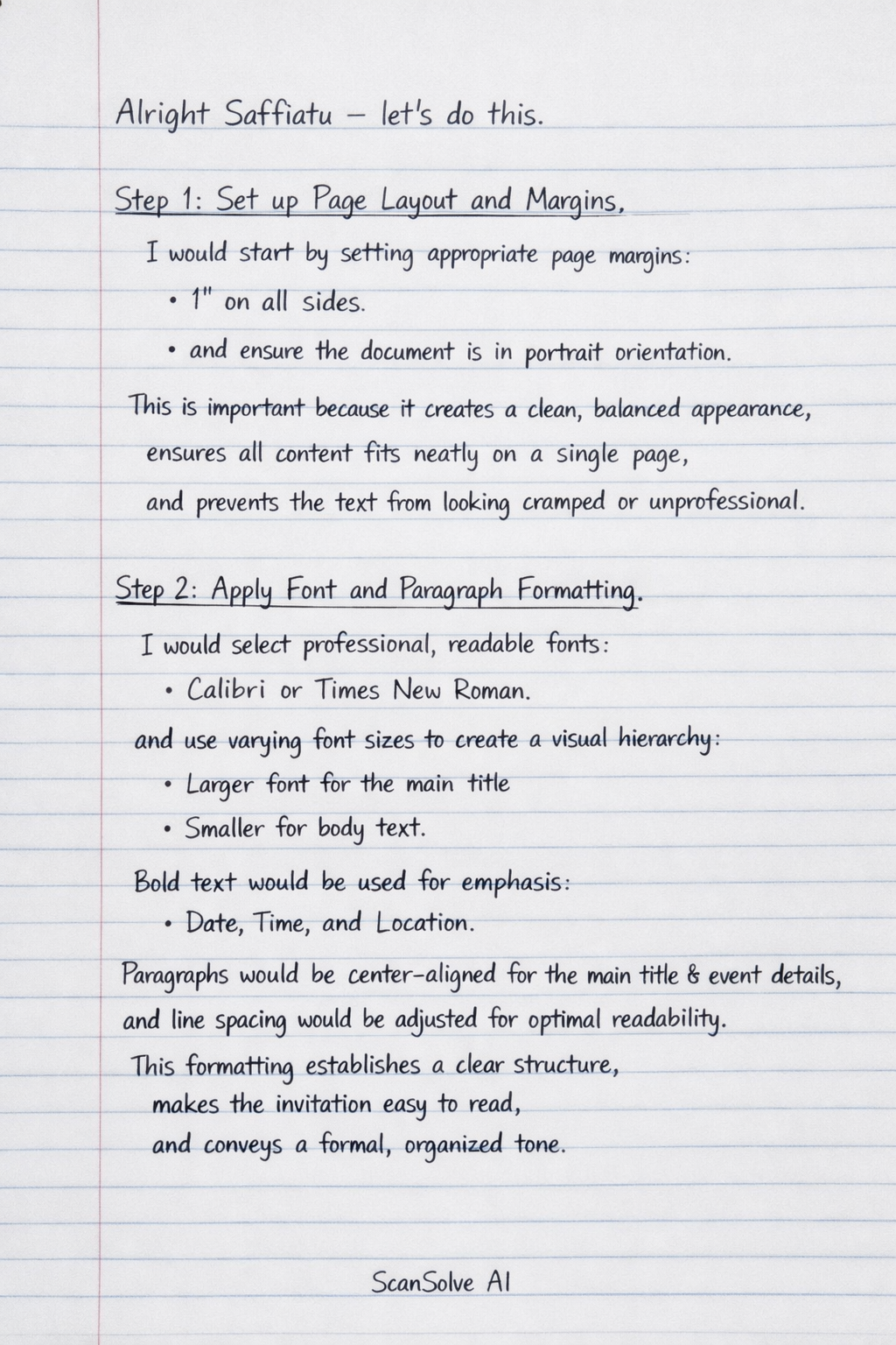
Set up Page Layout and Margins.
I would start by setting appropriate page margins (e.g., 1 inch on all sides) and ensuring the document is in portrait orientation. This is important because it creates a clean, balanced appearance, ensures all content fits neatly on a single page, and prevents the text from looking cramped or unprofessional.
Apply Font and Paragraph Formatting.
I would select professional, readable fonts (e.g., Calibri or Times New Roman) and use varying font sizes to create a visual hierarchy (e.g., a larger font for the main title, smaller for body text). Bold text would be used for emphasis on key details like date, time, and location. Paragraphs would be center-aligned for the main title and event details, and line spacing would be adjusted for optimal readability. This formatting establishes a clear structure, makes the invitation easy to read, and conveys a formal, organized tone.
Insert Images and Logos.
I would insert the school's official logo at the top of the invitation. Using text wrapping options (like "Square" or "Tight") would allow for precise placement, ensuring the logo integrates seamlessly with the text. This is important for branding, adding visual appeal, and reinforcing the school's identity, making the invitation instantly recognizable and professional.
Utilize Proofreading Tools (Spell Check and Grammar Check).
Before finalizing, I would use Word's built-in spell check and grammar check features to identify and correct any typographical errors or grammatical mistakes. This is crucial because an invitation with errors appears unprofessional and can detract from the importance of the event, undermining the school's credibility.
Apply Styles for Consistency.
I would use Word's "Styles" feature to apply consistent formatting to different elements, such as "Heading 1" for the main title and "Normal" for the body text. This ensures uniform appearance throughout the invitation, saving time and guaranteeing a polished, consistent look without manual adjustments for each section.
Add Borders and Shading.
To enhance the visual appeal, I might add a subtle page border or use light shading for specific sections (e.g., the RSVP information). This feature helps to frame the content, draw attention to important details, and give the invitation a more refined and finished look, contributing to its overall professionalism.
Still stuck on this one?
Ask a follow-up, and the answer starts from this question.
More Computer Science Questions
Handwritten Step-by-Step Solution
Get this as a handwritten image on WhatsApp — like a tutor wrote it for you.
Try on WhatsApp