
We read your photo as:
Plot the scatter diagram.
ScanSolve AI Answer
Answer
Step-by-step solution
3 stepsHere's how to approach this problem:
Plot the scatter diagram.
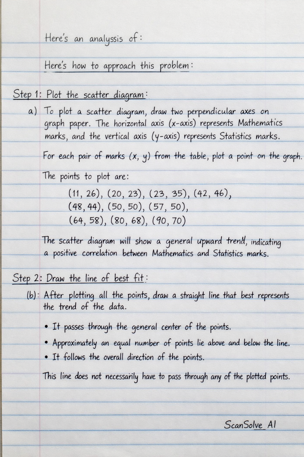
a) To plot a scatter diagram, you need to draw two perpendicular axes on graph paper. The horizontal axis (x-axis) represents Mathematics marks, and the vertical axis (y-axis) represents Statistics marks.
For each pair of marks from the table, plot a point on the graph.
The points to plot are:The scatter diagram will show a general upward trend, indicating a positive correlation between Mathematics and Statistics marks.
Draw the line of best fit.
b) After plotting all the points, draw a straight line that best represents the trend of the data. This line, called the line of best fit, should be drawn such that:
- It passes through the general center of the points.
- Approximately an equal number of points lie above and below the line.
- It follows the overall direction of the points. This line does not necessarily have to pass through any of the plotted points.
Estimate the student's mark in Statistics.
c) To estimate a student's mark in Statistics if their mark in Mathematics is 40, you would use the line of best fit drawn in Step 2.
- Locate on the Mathematics (horizontal) axis.
- Draw a vertical line from upwards until it intersects your line of best fit.
- From the intersection point on the line of best fit, draw a horizontal line to the Statistics (vertical) axis.
- Read the value where this horizontal line intersects the Statistics axis. This value is the estimated mark.
Based on the general trend of the data, if a student scores 40 in Mathematics, their estimated mark in Statistics would be approximately .
Try one yourself
A new problem that tests the same skill.
Still stuck on this one?
Ask a follow-up, and the answer starts from this question.
More English Questions
Handwritten Step-by-Step Solution
Get this as a handwritten image on WhatsApp — like a tutor wrote it for you.
Try on WhatsApp