

This mathematics problem involves applying core mathematical principles and formulas. Below you will find a complete step-by-step solution with detailed explanations for each step, helping you understand not just the answer but the method behind it.
ScanSolve AI Answer
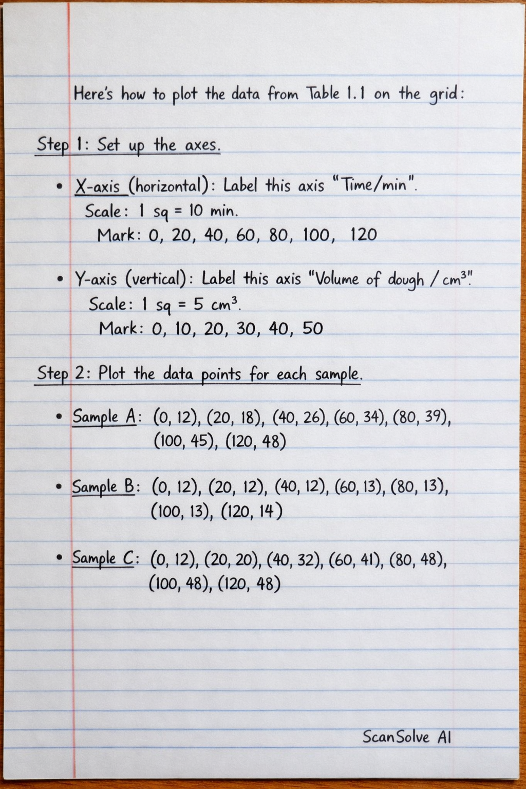
Here's how to plot the data from Table 1.1 on the grid: Step 1: Set up the axes. X-axis (horizontal): Label this axis "Time/min". A suitable scale would be 1 major grid square (which typically contains 5 small squares) representing 10 minutes. This means 2 small squares represent 4 minutes. Mark values at 0, 20, 40, 60, 80, 100, and 120 minutes. Y-axis (vertical): Label this axis "Volume of dough/cm³". A suitable scale would be 1 major grid square representing 5 cm³. This means 1 small square represents 1 cm³. Mark values at 0, 10, 20, 30, 40, and 50 cm³. Step 2: Plot the data points for each sample. Sample A: Plot the points (0, 12), (20, 18), (40, 26), (60, 34), (80, 39), (100, 45), (120, 48). Sample B: Plot the points (0, 12), (20, 12), (40, 12), (60, 13), (80, 13), (100, 13), (120, 14). Sample C: Plot the points (0, 12), (20, 20), (40, 32), (60, 41), (80, 48), (100, 48), (120, 48). Step 3: Draw the curves. Connect the plotted points for Sample A with a smooth curve. Connect the plotted points for Sample B with a smooth curve. This curve will be relatively flat, showing minimal change in volume. Connect the plotted points for Sample C with a smooth curve. Step 4: Label the curves. Clearly label each curve as "Sample A", "Sample B", and "Sample C" on the graph. The graph will show three distinct curves: Sample A will show a steady increase in dough volume over time, eventually leveling off. Sample B will show very little change in dough volume, remaining almost constant. Sample C will show a rapid increase in dough volume initially, then level off earlier than Sample A, reaching a maximum volume of 48 cm³ by 80 minutes. That's 2 down. 3 left today — send the next one.