
This mathematics problem involves applying core mathematical principles and formulas. Below you will find a complete step-by-step solution with detailed explanations for each step, helping you understand not just the answer but the method behind it.
ScanSolve AI Answer
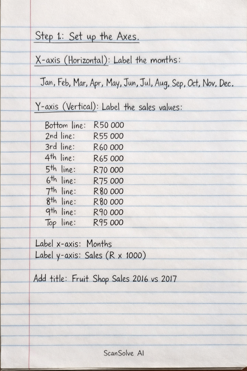
To draw the graphs comparing the sales figures for 2016 and 2017, follow these steps on the provided grid: Step 1: Set up the Axes. X-axis (Horizontal): Label the 12 major vertical grid lines from left to right as the months: Jan, Feb, Mar, Apr, May, Jun, Jul, Aug, Sep, Oct, Nov, Dec. Y-axis (Vertical): Label the 10 major horizontal grid lines from bottom to top. Let the bottom-most line represent R50 000 (since the table is R x 1000). Each subsequent major horizontal line will increase by R5 000. So, the labels will be: Bottom line: R50 000 2nd line: R55 000 3rd line: R60 000 4th line: R65 000 5th line: R70 000 6th line: R75 000 7th line: R80 000 8th line: R85 000 9th line: R90 000 Top line: R95 000 Axis Labels: Label the x-axis "Months" and the y-axis "Sales (R x 1000)". Graph Title: Add a title to the graph, such as "Fruit Shop Sales 2016 vs 2017". Step 2: Plot the 2016 Sales Data (Solid Line). Plot the following points on your graph. After plotting all points, connect them with a solid line. Jan: 67 (approximately two-fifths of the way between R65 000 and R70 000) Feb: 69 (approximately four-fifths of the way between R65 000 and R70 000) Mar: 85 (on the R85 000 line) Apr: 75 (on the R75 000 line) May: 86 (approximately one-fifth of the way between R85 000 and R90 000) Jun: 75 (on the R75 000 line) Jul: 71 (approximately one-fifth of the way between R70 000 and R75 000) Aug: 59 (approximately four-fifths of the way between R55 000 and R60 000) Sep: 92 (approximately two-fifths of the way between R90 000 and R95 000) Oct: 95 (on the R95 000 line) Nov: 75 (on the R75 000 line) Dec: 65 (on the R65 000 line) Step 3: Plot the 2017 Sales Data (Dotted Line). Plot the following points on the same axes. After plotting all points, connect them with a dotted line. Jan: 69 (approximately four-fifths of the way between R65 000 and R70 000) Feb: 73 (approximately three-fifths of the way between R70 000 and R75 000) Mar: 83 (approximately three-fifths of the way between R80 000 and R85 000) Apr: 88 (approximately three-fifths of the way between R85 000 and R90 000) May: 79 (approximately four-fifths of the way between R75 000 and R80 000) Jun: 73 (approximately three-fifths of the way between R70 000 and R75 000) Jul: 67 (approximately two-fifths of the way between R65 000 and R70 000) Aug: 63 (approximately three-fifths of the way between R60 000 and R65 000) Sep: 90 (on the R90 000 line) Oct: 93 (approximately three-fifths of the way between R90 000 and R95 000) Nov: 79 (approximately four-fifths of the way between R75 000 and R80 000) Dec: 71 (approximately one-fifth of the way between R70 000 and R75 000) Step 4: Add a Legend. Create a legend on your graph to distinguish between the two years: 2016: \_\_\_\_\_\_\_\_\_\_ (Solid Line) 2017: - - - - - - - - (Dotted Line) The completed graph will visually compare the monthly sales trends for 2016 and 2017. That's 2 down. 3 left today — send the next one.