
Plot a graph of x and t X are 1.89, 2.45, 3.16, 4.07, 5.37, 6.61, 8.71 while t are 1.60, 2.50, 4.00, 6.40, 10.0, 15.9, 25.1
ScanSolve AI Answer
Answer
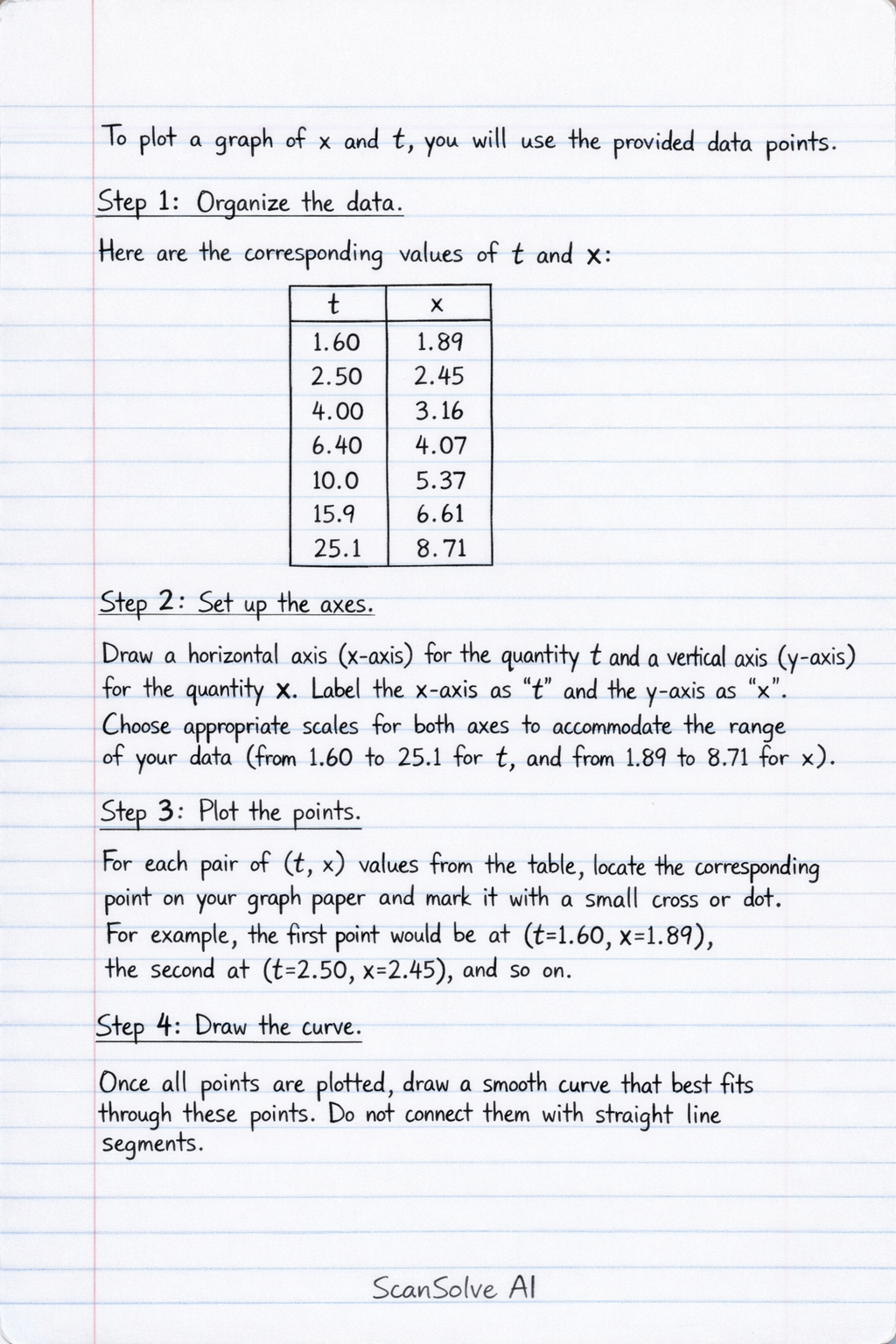
To plot a graph of and , you will use the provided data points.
Step-by-step solution
4 stepsOrganize the data*.
Here are the corresponding values of and :
1.60 1.89 2.50 2.45 4.00 3.16 6.40 4.07 10.0 5.37 15.9 6.61 25.1 8.71 Set up the axes*.
Draw a horizontal axis (x-axis) for the quantity and a vertical axis (y-axis) for the quantity . Label the x-axis as "" and the y-axis as "". Choose appropriate scales for both axes to accommodate the range of your data (from 1.60 to 25.1 for , and from 1.89 to 8.71 for ).
Plot the points*.
For each pair of values from the table, locate the corresponding point on your graph paper and mark it with a small cross or dot. For example, the first point would be at , the second at , and so on.
Draw the curve*.
Once all points are plotted, draw a smooth curve that best fits through these points. Do not connect them with straight line segments.
The graph of versus for the equation will typically be a curve (specifically, a power curve), not a straight line. If you were to plot against , as discussed in the previous problem, you would obtain a straight line.
Still stuck on this one?
Ask a follow-up, and the answer starts from this question.
More English Questions
Handwritten Step-by-Step Solution
Get this as a handwritten image on WhatsApp — like a tutor wrote it for you.
Try on WhatsApp