
We read your photo as:
Draw a neat, fully labelled SINGLE BAR GRAPH to represent this information. Your graph must have a heading, labelled axes, an appropriate scale and evenly spaced bars of equal width. Use the grid provided below (or attach your own graph paper).
ScanSolve AI Answer
Step-by-step solution
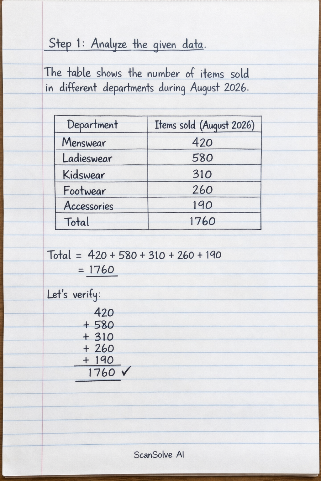
4 stepsAnalyze the given data.
The table shows the number of items sold in different departments during August 2026.
Department Items sold (August 2026) Menswear 420 Ladieswear 580 Kidswear 310 Footwear 260 Accessories 190 Total 1760 Address Question 5.1.
To draw a single bar graph:
- Heading: "Items Sold per Department (August 2026)"
- X-axis (horizontal): Label this axis "Department" and list the departments (Menswear, Ladieswear, Kidswear, Footwear, Accessories) with evenly spaced bars.
- Y-axis (vertical): Label this axis "Number of Items Sold". Choose an appropriate scale, for example, from 0 to 600, with increments of 50 or 100.
- Bars: Draw bars of equal width for each department, with the height of each bar corresponding to the number of items sold. For example, the bar for Ladieswear would reach 580 on the y-axis.
Address Question 5.2.
Identify the department with the highest and lowest sales from the table.
- Highest sales: Ladieswear with 580 items.
- Lowest sales: Accessories with 190 items.
The department that sold the most items is Ladieswear, and the department that sold the fewest items is Accessories.
Address Question 5.3.
Name one other way to represent the data and give a reason for using a bar graph.
- Other representation: A pie chart could also represent this data, showing each department's sales as a proportion of the total sales.
- Reason for bar graph: A bar graph is a good choice for comparing departments because the different heights of the bars make it easy to visually compare the sales figures of each department directly and quickly identify which department sold more or less than others.
Here are the answers to the questions:
5.1) To draw a neat, fully labelled SINGLE BAR GRAPH:
- Heading: Items Sold per Department (August 2026)
- X-axis: Label "Department" with categories: Menswear, Ladieswear, Kidswear, Footwear, Accessories.
- Y-axis: Label "Number of Items Sold" with an appropriate scale (e.g., 0 to 600, in increments of 50 or 100).
- Bars: Draw bars of equal width for each department, with heights corresponding to their respective sales figures (Menswear: 420, Ladieswear: 580, Kidswear: 310, Footwear: 260, Accessories: 190).
5.2) The department that sold the most items is Ladieswear, and the department that sold the fewest items is Accessories.
5.3) Another way this data could be represented is a pie chart. A bar graph is a good choice for comparing departments because it allows for easy visual comparison of the magnitude of sales between different categories.
Still stuck on this one?
Ask a follow-up, and the answer starts from this question.
More Mathematics Questions
Handwritten Step-by-Step Solution
Get this as a handwritten image on WhatsApp — like a tutor wrote it for you.
Try on WhatsApp