
We read your photo as:
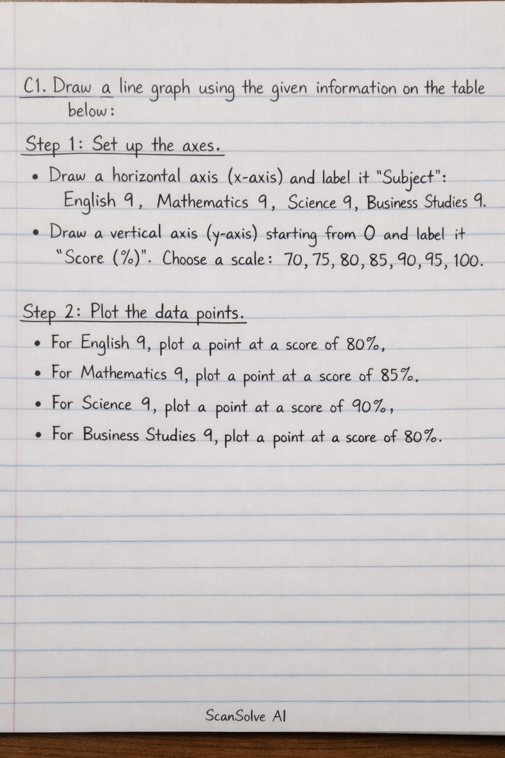
Draw a line graph using the given information on the table below:
Mathematics
ScanSolve AI Answer
Answer
To draw a line graph for the given data, we will plot the subjects on the horizontal axis (x-axis) and the scores on the vertical axis (y-axis).
Step-by-step solution
3 stepsC1. Draw a line graph using the given information on the table below:
Set up the axes.
- Draw a horizontal axis (x-axis) and label it "Subject". Mark equally spaced points for each subject: English 9, Mathematics 9, Science 9, Business Studies 9.
- Draw a vertical axis (y-axis) starting from 0 and label it "Score (%)". Choose an appropriate scale, for example, increments of 10 or 5, to cover the range of scores from 80 to 90. A scale from 70 to 100 with increments of 5 would be suitable to show the variation clearly.
Plot the data points.
- For English 9, plot a point at a score of .
- For Mathematics 9, plot a point at a score of .
- For Science 9, plot a point at a score of .
- For Business Studies 9, plot a point at a score of .
The coordinates for the points would be:
- (English 9, 80)
- (Mathematics 9, 85)
- (Science 9, 90)
- (Business Studies 9, 80)
Connect the plotted points with straight lines.
- Draw a straight line from the point for English 9 to the point for Mathematics 9.
- Draw a straight line from the point for Mathematics 9 to the point for Science 9.
- Draw a straight line from the point for Science 9 to the point for Business Studies 9.
The resulting graph will show the trend of scores across the different subjects.
Since I cannot physically draw the graph here, the description above outlines the steps to construct it.
Was this helpful?
Still stuck on this one?
Ask a follow-up, and the answer starts from this question.
Got a different question?Ask your own question
More Mathematics Questions
QDraw a line graph to illustrate your results. What will be on the x-axis and what will be on the…QDraw a distance-time graph using the provided table data, with appropriate scales for the axes.QDraw a bar graph to represent the data in the table. Label the axes of your graph.QPlot the information from the above table on the Cartesian Plane with a ruler to form a straight…QDraw a neat, fully labelled SINGLE BAR GRAPH to represent this information. Your graph must have a…
Handwritten Step-by-Step Solution
Get this as a handwritten image on WhatsApp — like a tutor wrote it for you.
Try on WhatsApp