

This mathematics problem involves applying core mathematical principles and formulas. Below you will find a complete step-by-step solution with detailed explanations for each step, helping you understand not just the answer but the method behind it.
ScanSolve AI Answer
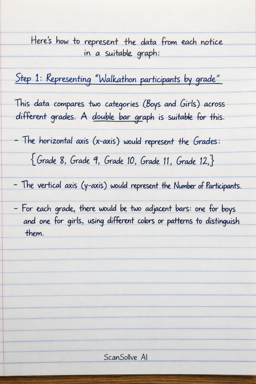
Here's how to represent the data from each notice in a suitable graph: Step 1: Representing "Walkathon participants by grade" This data compares two categories (Boys and Girls) across different grades. A double bar graph is suitable for this. The horizontal axis (x-axis) would represent the Grades* (Grade 8, Grade 9, Grade 10, Grade 11, Grade 12). The vertical axis (y-axis) would represent the Number of Participants*. For each grade, there would be two adjacent bars: one for boys and one for girls, using different colors or patterns to distinguish them. Step 2: Representing "Times taken by the participants to complete the walkathon" This data shows the frequency of participants within specific time intervals. A histogram is suitable for this type of continuous, grouped data. The horizontal axis (x-axis) would represent the Time taken (minutes)*, with intervals like 0-30, 31-60, 61-90, and 91-120. The vertical axis (y-axis) would represent the Number of Participants* (frequency). The bars in a histogram touch each other to indicate the continuous nature of the data. Step 3: Representing "Walkathon prize winners by grade" This data shows the number of prize winners for each distinct grade. A bar graph (or column graph) is suitable for this. The horizontal axis (x-axis) would represent the Grades* (Grade 8, Grade 9, Grade 10, Grade 11). The vertical axis (y-axis) would represent the Number of Prize Winners*. Each bar would correspond to a grade, showing the count of prize winners for that grade. Last free one today — make it count tomorrow, or type /upgrade for unlimited.